
Overview
At Dripdek, we've curated an online shopping experience like no other. With a focus on unique designs and quality products, our platform offers an extensive collection of eye-catching t-shirts, tumblers, and mugs. Our user-friendly website ensures seamless navigation, allowing customers to effortlessly explore our diverse range of offerings and express their individuality with ease. From bold and colorful apparel to stylish and durable drinkware, each item is carefully crafted to make a statement. With our commitment to excellence in product selection, customer service, and digital marketing, Dripdek is your destination for products that are anything but ordinary. Join us and discover why we're Better than Boring.

Tasks
The objective was to develop a product from the ground up, involving comprehensive planning and analysis.
This encompassed:
Character Profiles
User Stories
Problem Statements
User Maps
Value Propositions
Goal Statements
User Flows
Storyboards
User Research
Journey Maps
Paper Wireframes
Digital Wireframes
Lo-fidelity Prototypes
Hi-Fidelity Prototypes
Usability Studies

Design Process
User Personas
Personas are key ingredients in crafting successful products. They inform design decisions by identifying common user needs early on, even before design work starts. This helps everyone on the team understand who they're building for, what users are trying to achieve, and what they're capable of.


Problem Statement
In UX design, a problem statement is like a detective's first clue. It clearly describes a specific user challenge, setting the stage for targeted research and guiding the design team towards creating solutions that actually work.
Samantha is a fashion-forward individual who needs an online shopping platform that offers convenience and a wide selection of unique, high-quality products because she values expressing her individuality through her fashion choices and desires a seamless shopping experience that aligns with her busy lifestyle.
James is a busy professional who needs an efficient and reliable online shopping experience because he values quality products and convenience, seeking a streamlined process that fits seamlessly into his hectic schedule.
Empathy Mapping
Imagine diving into your users' heads to see things from their perspective. Empathy mapping lets you do just that! It's like a mind-reading tool that helps you understand their needs, wants, and frustrations. This helps reveal any mismatches between what they need and what's currently available, showing opportunities to design better solutions.


User Journey
Think of a User Journey Map as a roadmap of your user's experience with your product or service. It shows everything they see, do, and feel at each step, from start to finish. This helps teams understand what motivates users, where they might get stuck, and how to improve their experience overall.

Information Architecture
Imagine a library without shelves or categories. That's what a website could be like without good information architecture (IA). IA is like the librarian sorting and organizing everything, making it easy for you to find what you need. It involves grouping similar information together, creating clear labels, and designing intuitive pathways so you can navigate smoothly and logically.

User Research Pain Points
Limited Selection
Despite curation, users might still feel the product options are restricted compared to broader online retailers. They might struggle to find very specific styles or unique pieces outside the curated selection.
Bad Recommendations
Personalized recommendations could become repetitive or miss the mark if the system doesn’t accurately capture user preferences. This could lead to frustration and missed opportunities for discovering new favorites.
Inconsistent Quality
While Dripdek emphasizes quality materials, users might encounter occasional inconsistencies, especially with new brands or less established vendors. This could create trust issues and discourage repeat purchases.
Difficulty with Styling
While some users thrive on curated options, others might miss the ability to explore and mix-and-match freely. This lack of styling flexibility could limit their creative expression and discovery of personal style.
Low Fidelity Wireframes
Imagine sketching a website's basic layout - that's what low-fidelity wireframes are! They're like rough drafts that focus on the core structure and important elements, not fancy decorations. This lets designers and everyone involved get a clear picture of how the website will work early on, before getting caught up in the details.

User Research Findings
Product Accuracy
Clear and accurate depiction of the final product in the real world rather than an artificial representation.
Clear Listings
Differentiating between a category listing and a collection listing. While not specifically labeled as such on the website, it’s important to provide customers with an easy way to find a product in the easiest manner possible whether through product type or style type.
Notable Adjustments


Style Guide
Think of a style guide as the rulebook for how your product looks and feels. It's a clear and concise document that tells everyone involved (designers, developers, etc.) how to use elements like fonts, colors, icons, and images to create a consistent experience for users. This consistency helps users feel comfortable and familiar with your product, no matter where they interact with it.

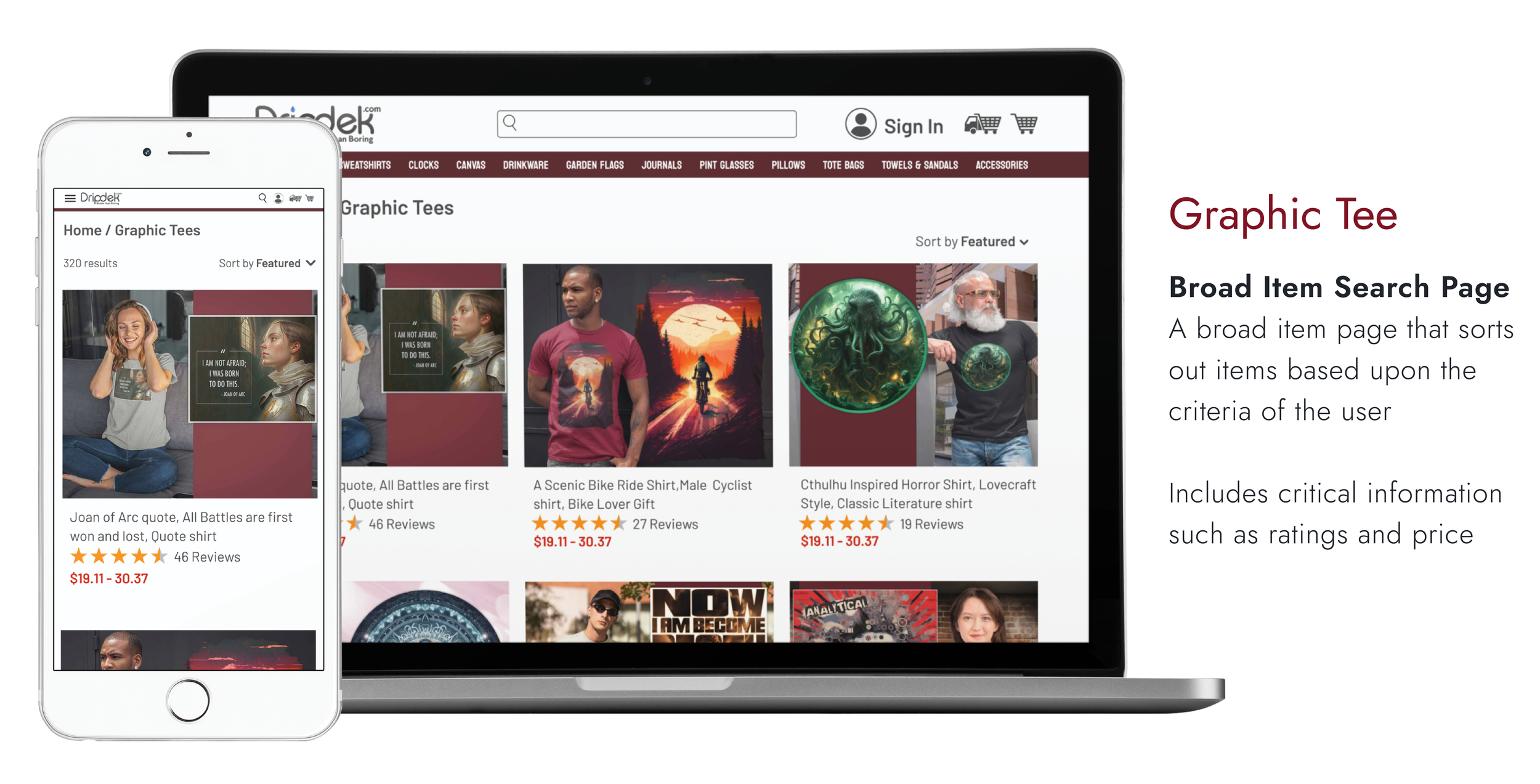
High Fidelity Mockup
Imagine a website that looks and acts almost real, complete with colors, fonts, and buttons you can click. That's what a high-fidelity mockup is in UX design! It's like a detailed preview of the final product, showing everyone involved (managers, designers, etc.) exactly how it will work and look. This helps them give feedback and make sure everyone agrees on the direction before coding starts.
Try the desktop right HERE
Try the tablet right HERE
Try the mobile right HERE


Accessibility Considerations
In designing my phone app, incorporating contrast is crucial for accessibility to users with visual impairments. By strategically using color differences, I enhance legibility and distinguish between various interface elements, ensuring a more inclusive and user-friendly experience.
Labeling images is crucial to ensure accessibility for the hearing impaired who rely on text readers. By providing descriptive labels, I empower users to understand and engage with the content, creating an inclusive experience that goes beyond visual elements.
Features to compensate for periods of Internet insecurity are vital for ensuring a seamless user experience. By implementing offline functionalities, users can access essential features and data even when connectivity is unreliable or unavailable, enhancing the app’s reliability and usability in diverse network conditions.
Key Takeaways
Despite being a seasoned graphic designer, I found UX to be a rollercoaster of confusion and excitement. This project opened my eyes to the design choices behind everyday things, making me much more critical of professional work. I now often catch myself asking, "Did this even have a UX designer?"
Next Steps
Although this marks the conclusion of the current project, there are additional steps needed to bring this project to fruition. Here are some key next actions...
Development Handoff
Prepare a comprehensive package for the development team, including design specifications, assets, and any documentation needed to guide the implementation of your designs.
Collab with Developers
Work closely with the development team to address any questions, provide clarifications, and ensure a smooth transition from design to code.
Launch Planning
Collaborate with stakeholders to plan the launch of the concert ticket app. This may involve coordinating marketing efforts, communicating with users, and ensuring a smooth rollout.
Testing
Collaborate with the testing team to ensure that the implemented features align with the design and meet the specified requirements. Address any issues or discrepancies that may arise during the testing phase.
Monitoring and Feedback
Once the app is live, monitor user feedback and analytics to gather insights into user behavior and identify areas for improvement. This information can be valuable for future updates and iterations.
Iterative Changes
Be prepared for iterative changes as the development progresses. Stay engaged with the development team to address any design- related challenges that may emerge during the implementation phase.
Documentation
Keep design documentation up-to-date, reflecting any changes made during the development and post-launch phases. This documentation serves as a reference for future updates and provides insights for other team members.
Take Away
This project was a game-changer! I dove deeper into user research and usability testing, seeing firsthand how they shape design decisions. Moving through research, concepts, and prototyping highlighted the power of design thinking and putting users first. Crafting high-fidelity designs, especially with Figma's easy prototyping, was a thrill. Now, I feel accomplished and excited, ready to take on more user-centered projects!
For a PDF deck of this case study, click HERE